Interiors By Muhhammad
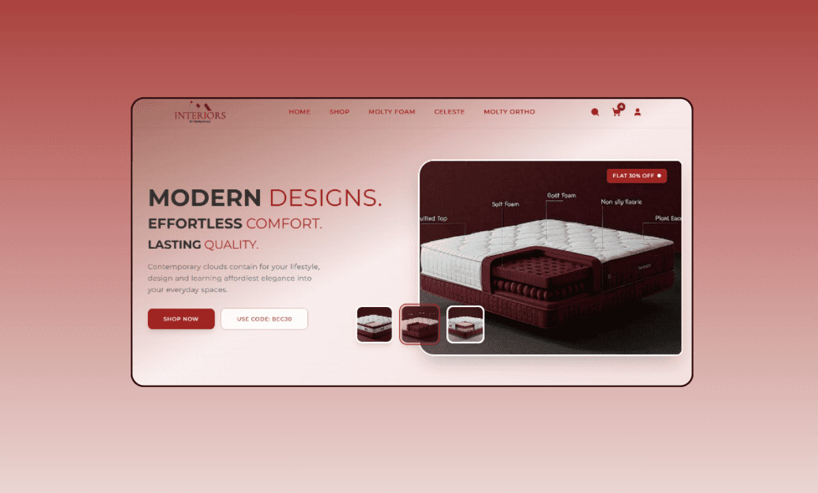
This project is a fully responsive e-commerce website for an interior design brand, built with Next.js, Tailwind CSS, and Framer Motion. It features a dynamic hero section with an interactive image gallery, an exclusive collection carousel, and a seasonal promotions area using a custom grid layout. The navbar includes a search toggle, mobile slide‑in menu, and bold filled icons. Every component is mobile‑first, with consistent maroon/red accents, clean typography, and smooth animations to create a premium brand experience.
Client
Muhammad
Service Provided
Furniture Website
The Goal & Challenge:
The primary business goal was to increase user engagement and conversion through an immersive, luxury digital experience. Achieving this required overcoming technical challenges: implementing complex, responsive layouts without breaking on any device; ensuring smooth, performant animations that trigger only once on viewport entry; and building a mobile menu that slides from the top with adjustable width for tablets while preserving the search bar’s behavior. Balancing aesthetic ambitions with fast load times and accessibility was also crucial to meet the client’s high standards.
1
Solution Delivered:
I built a complete Next.js frontend with Tailwind CSS and Framer Motion, delivering a high-performance, mobile-first website. The hero section features an auto‑rotating image gallery with clickable thumbnails. The exclusive collection section showcases product cards with animated hover effects and clear calls to action. The seasonal section implements a complex grid: a large main image, two small images on the top right, two on the bottom left, and a content box on the bottom right—all with inner image scaling on hover. The navbar includes an expandable search bar, a slide‑in mobile menu, and filled icons for a polished look.
2
Business Impact:
The delivered website successfully captures the brand’s premium identity, resulting in a polished, engaging user experience. The interactive elements—hover effects, image galleries, and seamless navigation—encourage exploration and boost conversion potential. The fully responsive design ensures a consistent experience across all devices, reaching a wider audience. By combining modern front‑end technologies with a strong focus on usability, the project not only satisfied the client’s immediate needs but also provided a scalable foundation for future e‑commerce features, making it a valuable asset for their business growth.
3


